The Fiends was a visual project built across a series of singles and EP releases. The goal was to create a consistent visual identity that could grow over time, but flexible enough to change with each release. I worked on building an art direction that could be reused and adapted, rather than starting from scratch every time.
As the band's former guitarist and graphic designer, I was responsible for developing the art direction for each single and EP release. This included creating artwork, posters, merchandise, reels, and music videos. I collaborated with my band-mates to ensure the visuals aligned with our sound and overall image.
The challenge of forming a band goes beyond creating unique music; it's about establishing a distinctive image and strong stage presence, both live and on social media. Visual communication was crucial in helping The Fiends stand out in Swansea and across South Wales.
In response to the challenges The Fiends were facing, particularly visual inconsistency and the need to stand out in a competitive music scene, I developed a strategy focused on building a strong, cohesive visual identity.
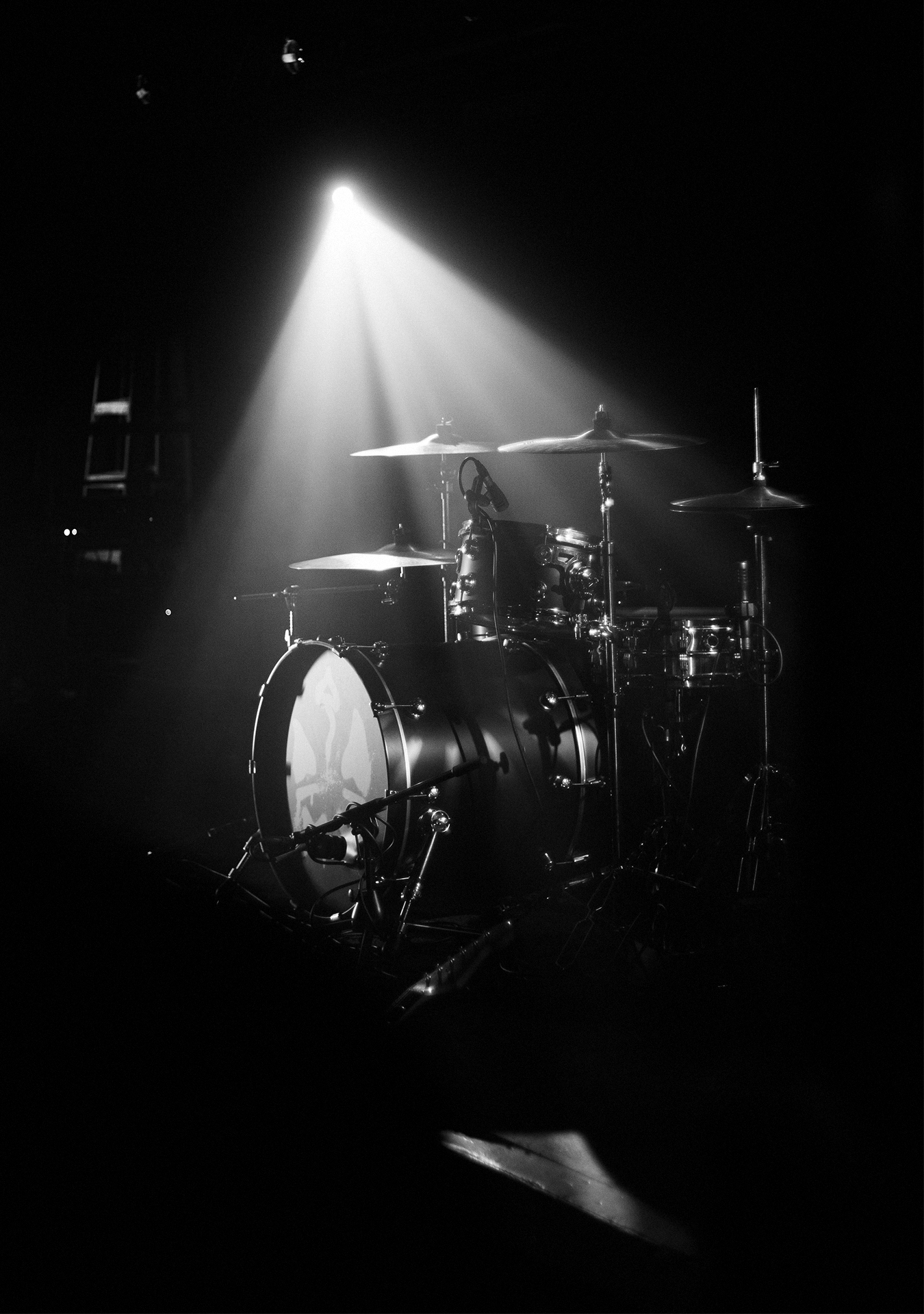
The visual identity for The Fiends was developed to translate the core strategy into a tangible and recognisable aesthetic. Building on the concept of a documentary-style approach, the visuals combine raw photography, layered compositions, and hand-drawn elements to create a sense of immediacy and authenticity.
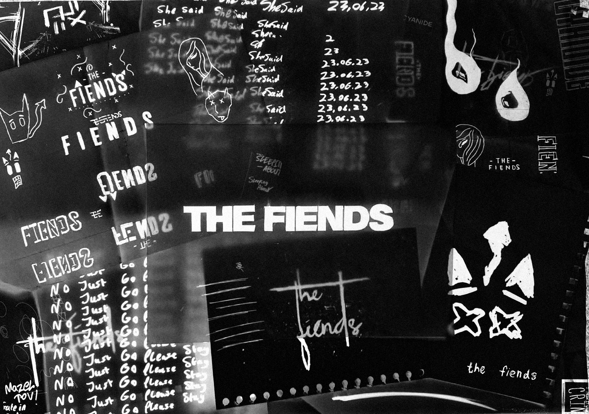
The grungy visual direction was first established through the early single artworks, using imagery directly inspired by each track’s lyrical content. Each release explored a different visual interpretation while maintaining consistency through the use of paper textures, sketch elements, and distressed compositions. This approach allowed every single to feel unique and narrative-driven, while still sitting within a cohesive system.
Since forming in 2020, the lads have gone strength to strength, evolving from a local indie act into a band with growing national and international recognition. Through a consistent visual identity and increasingly refined sound, they have built a strong and engaged fanbase. Their work has led to major milestones including high streaming figures, sold-out releases, festival appearances, and support slots with established artists, reflecting their steady upward trajectory within the music scene.
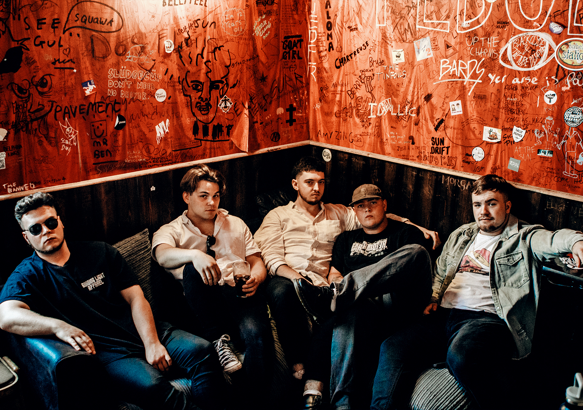
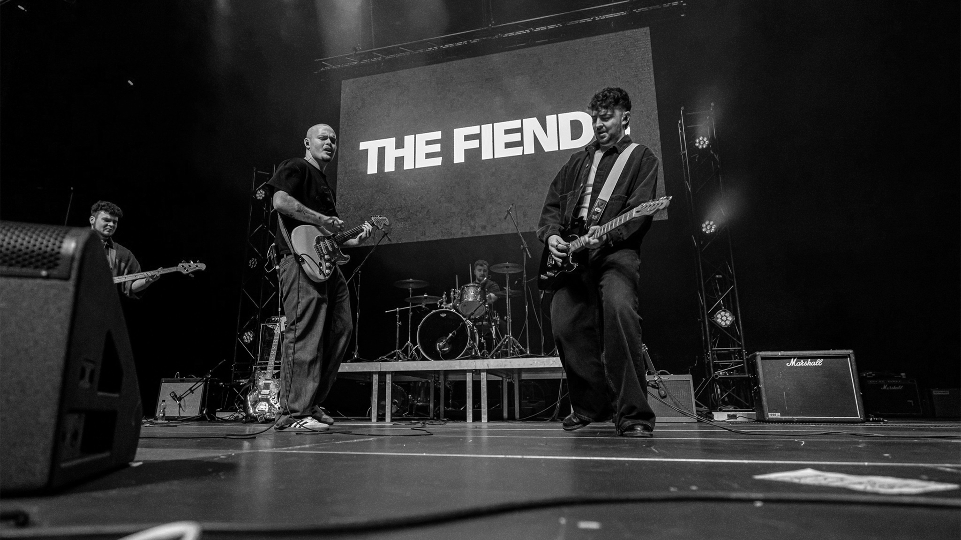
The Fiends are an alt-indie rock band from Swansea, South Wales, known for carving a sound that blends post-punk intensity with melodic indie rock and shoegaze-tinged atmosphere. Formed in 2020, the band consists of Ethan Goslett, Joshua Albrighton, Ben Quint, and Ceulan Williams. Following early releases including their EP Mazel Tov, they later signed with Revolver Records and toured the US in 2025.
For this brief, the aim was to create a visual language for UK band The Fiends, encompassing logo, photography, merch, and album art, that communicates the band's personality and ethos to potential fans, allowing them to stand out in a saturated market.
Services
Social Media Assets | Motion Graphics | Artwork | Print Design | Creative Art Direction
Sectors
Music & Entertainment | Digital Media | Creative Production |
The Client
The Fiends, Swansea, South Wales, UK
The Team
Ben Ballantyne - Creative Designer & Guitarist
Mazel Tov EP Photos - Matt Eynon
Cyanide Video Footage - Matchbox Studios

The Fiends was a visual project built across a series of singles and EP releases. The goal was to create a consistent visual identity that could grow over time, but flexible enough to change with each release. I worked on building an art direction that could be reused and adapted, rather than starting from scratch every time.
As the band's former guitarist and graphic designer, I was responsible for developing the art direction for each single and EP release. This included creating artwork, posters, merchandise, reels, and music videos. I collaborated with my band-mates to ensure the visuals aligned with our sound and overall image.
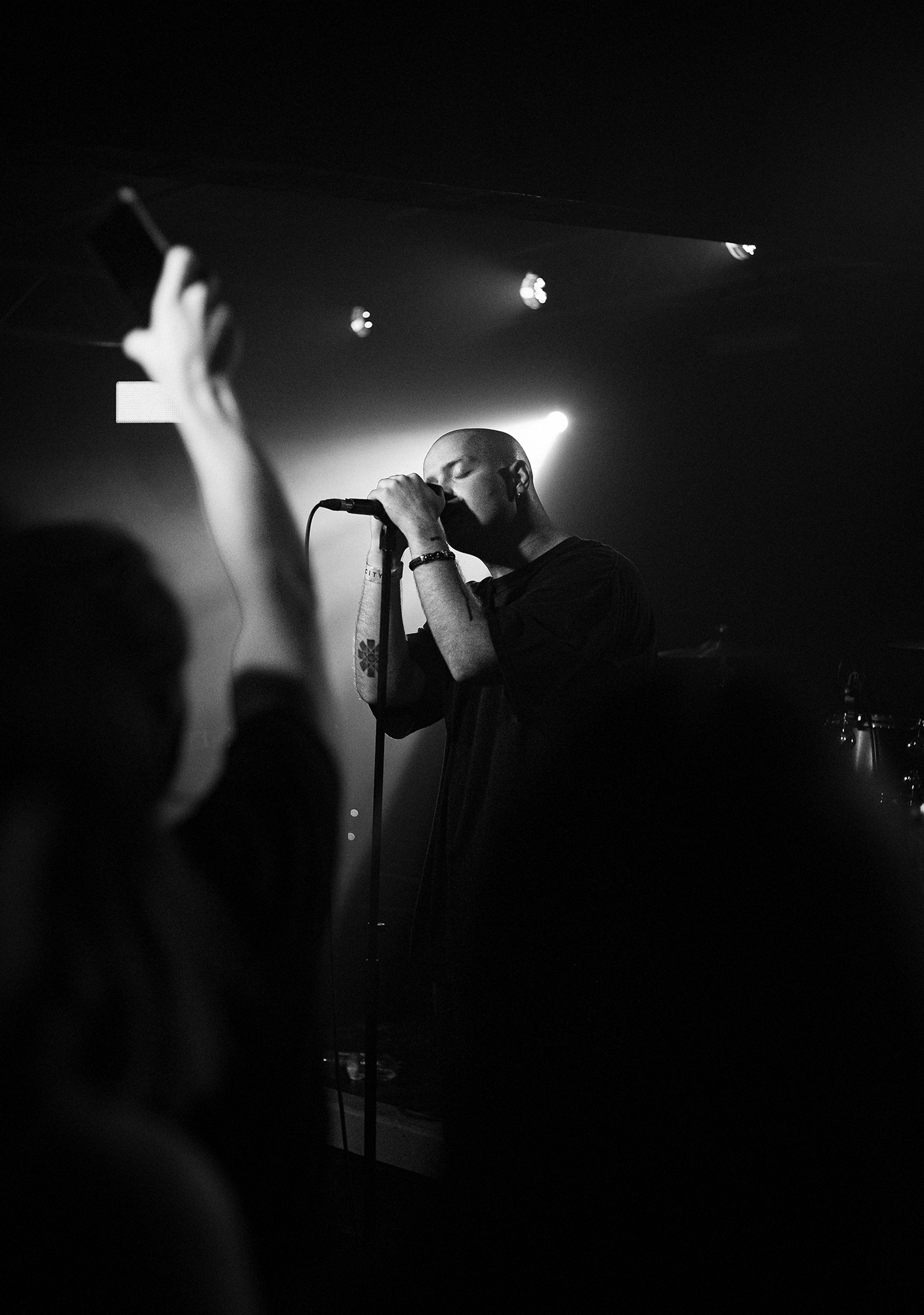
The challenge of forming a band goes beyond creating unique music; it's about establishing a distinctive image and strong stage presence, both live and on social media. Visual communication was crucial in helping The Fiends stand out in Swansea and across South Wales.
In response to the challenges The Fiends were facing, particularly visual inconsistency and the need to stand out in a competitive music scene, I developed a strategy focused on building a strong, cohesive visual identity.
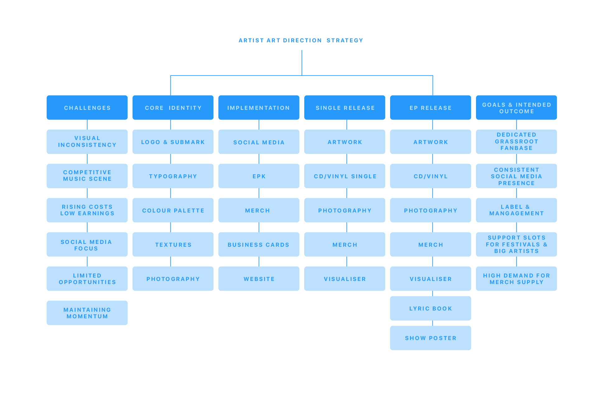
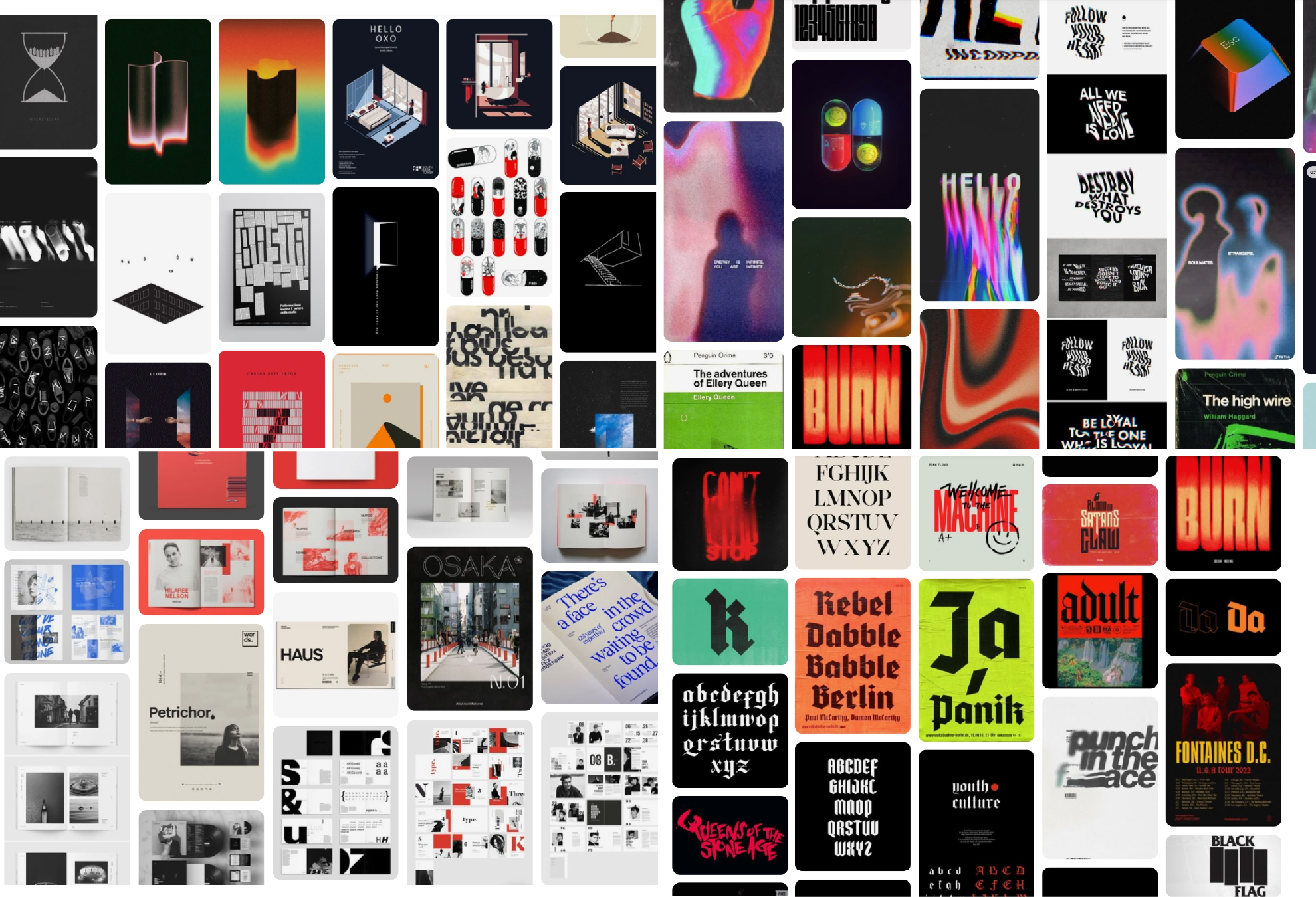
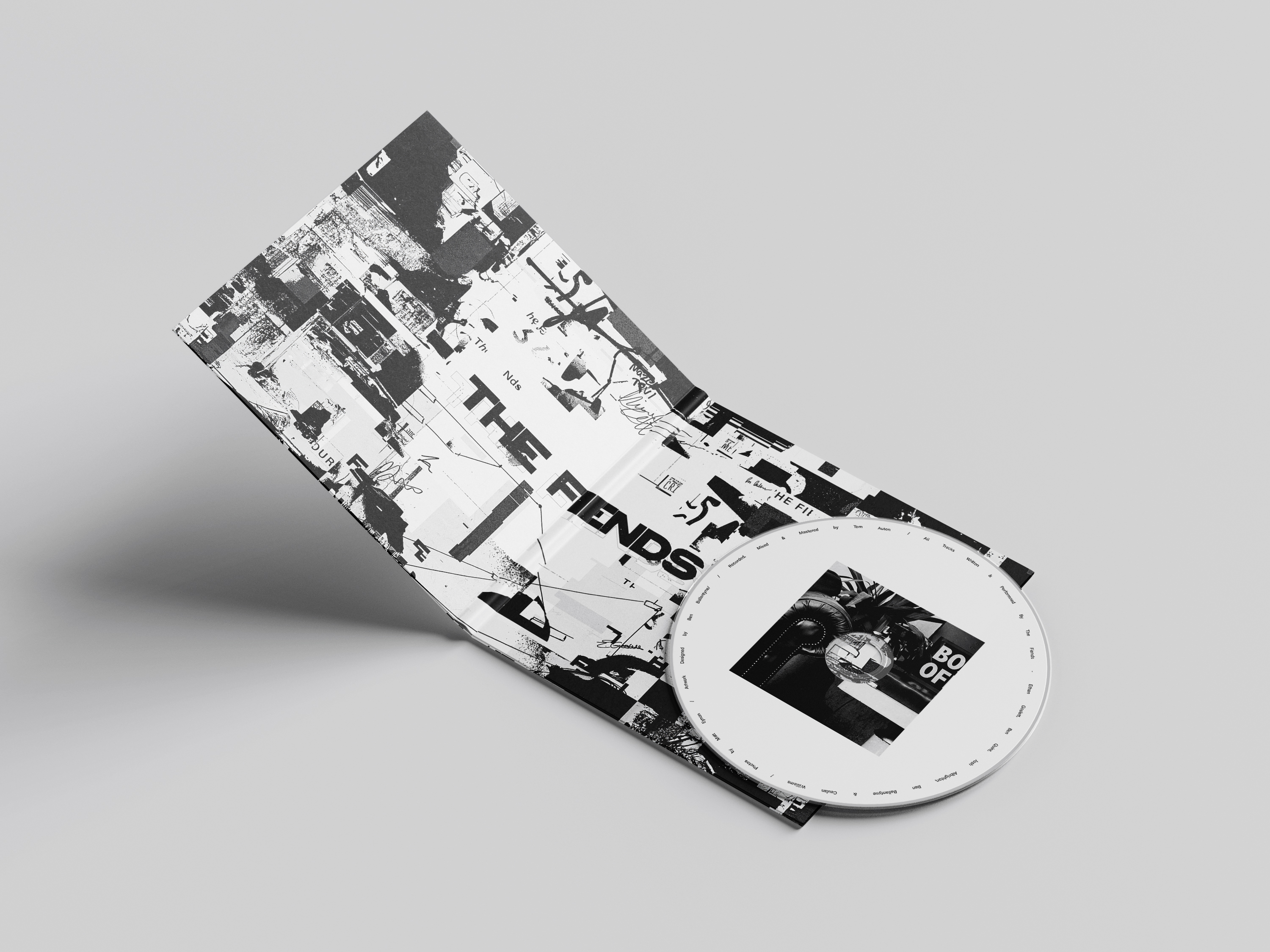
At the core of this approach was establishing a distinctive aesthetic rooted in paper textures, bold typography and hand-drawn sketch elements. This “documentary-style” visual language was chosen to reflect the band’s raw, dynamic sound while giving their brand an authentic and recognizable feel.
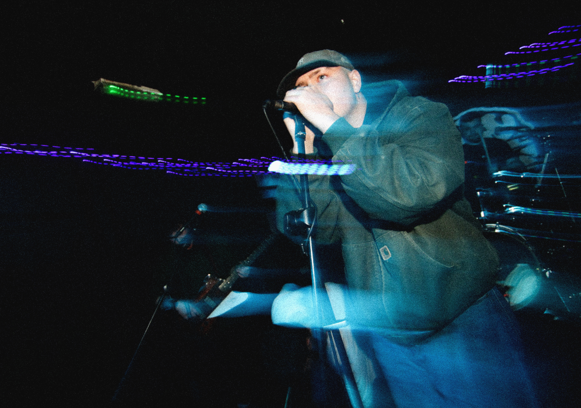
The visual identity for The Fiends was developed to translate the core strategy into a tangible and recognisable aesthetic. Building on the concept of a documentary-style approach, the visuals combine raw photography, layered compositions, and hand-drawn elements to create a sense of immediacy and authenticity.

At the core of The Fiends’ branding is the use of the Acumin Pro typeface, providing a clean and consistent foundation that contrasts with the raw, layered visuals. To introduce personality, a hand-drawn devil icon was developed, creating a distinctive and recognisable mark that reinforces the band’s attitude.
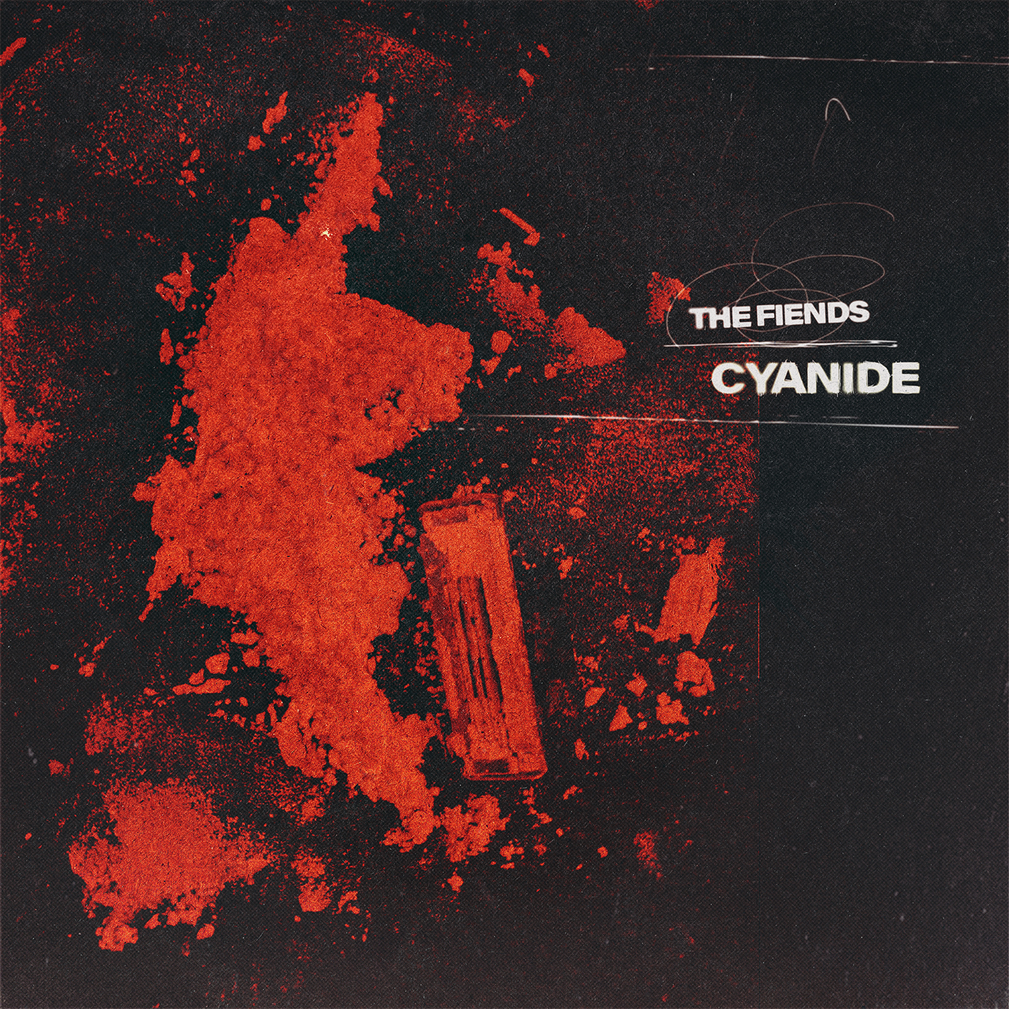
The grungy visual direction was first established through the early single artworks, using imagery directly inspired by each track’s lyrical content. Each release explored a different visual interpretation while maintaining consistency through the use of paper textures, sketch elements, and distressed compositions. This approach allowed every single to feel unique and narrative-driven, while still sitting within a cohesive system.


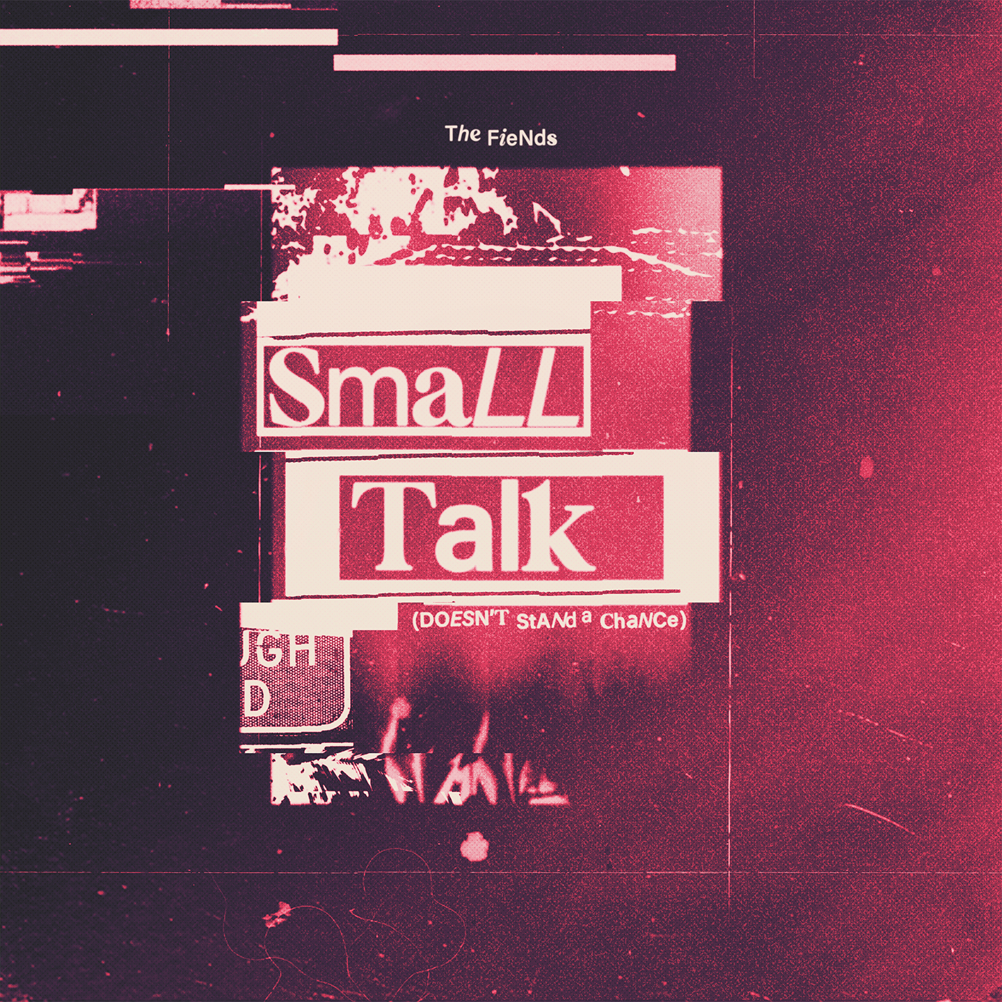

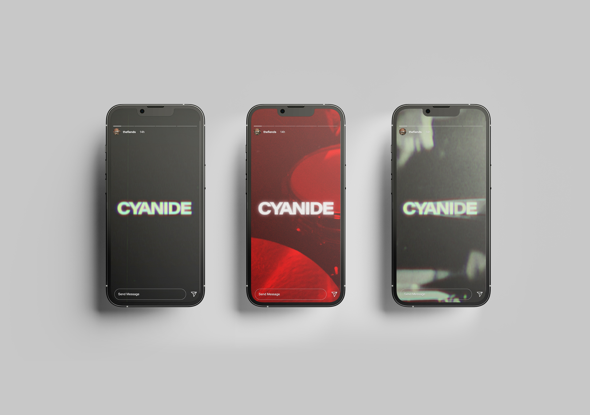
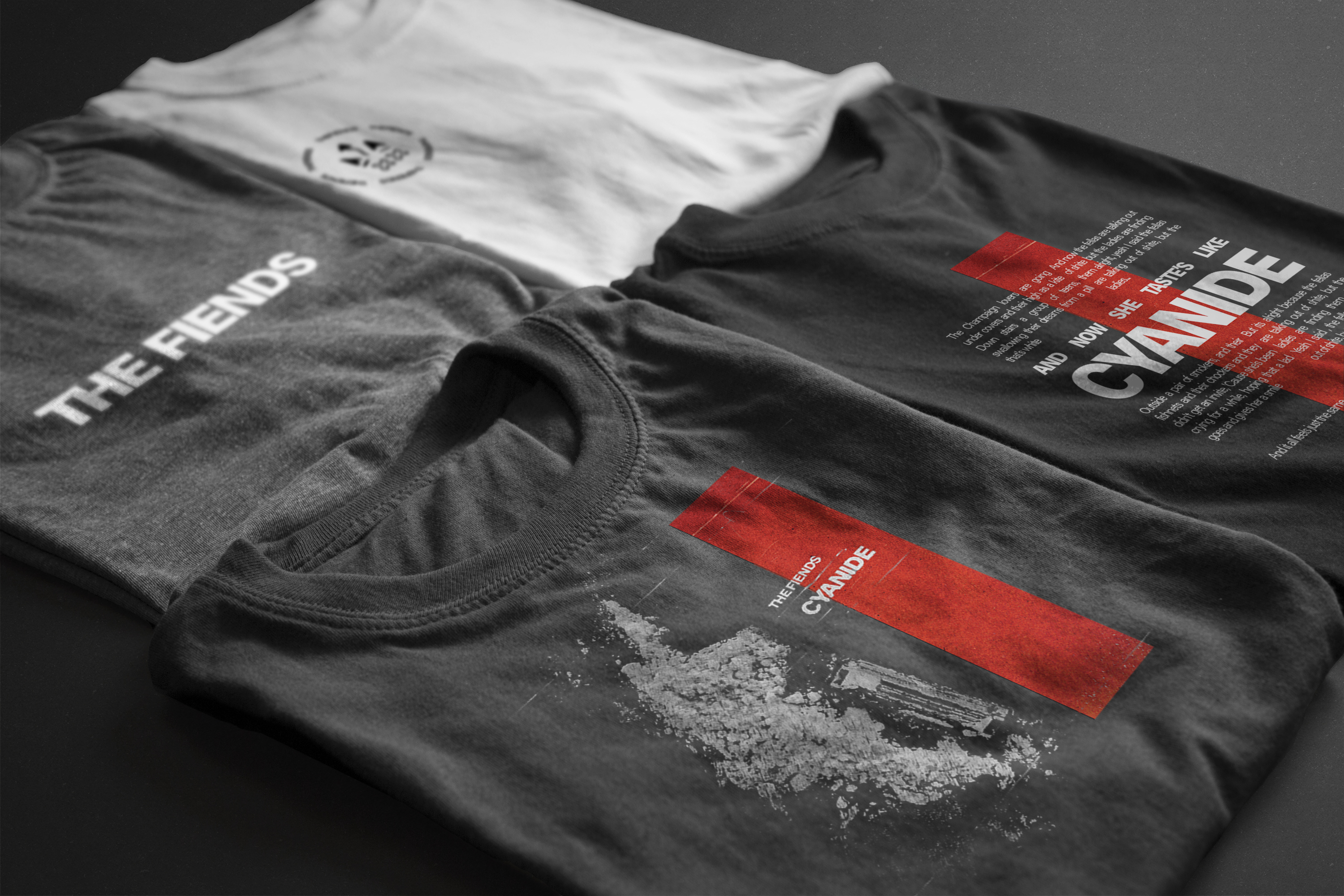
Building on the early singles, Cyanide refined the grungy aesthetic through a more mature and cohesive direction. The visuals reflected its theme of chaotic youth culture, using layered textures and narrative imagery to mirror the song’s energy. This release expanded into a wider campaign, including a music video and social content, strengthening consistency across platforms. The project marked a step forward in both visual execution and storytelling, aligning the band’s identity more closely with their sound and audience.
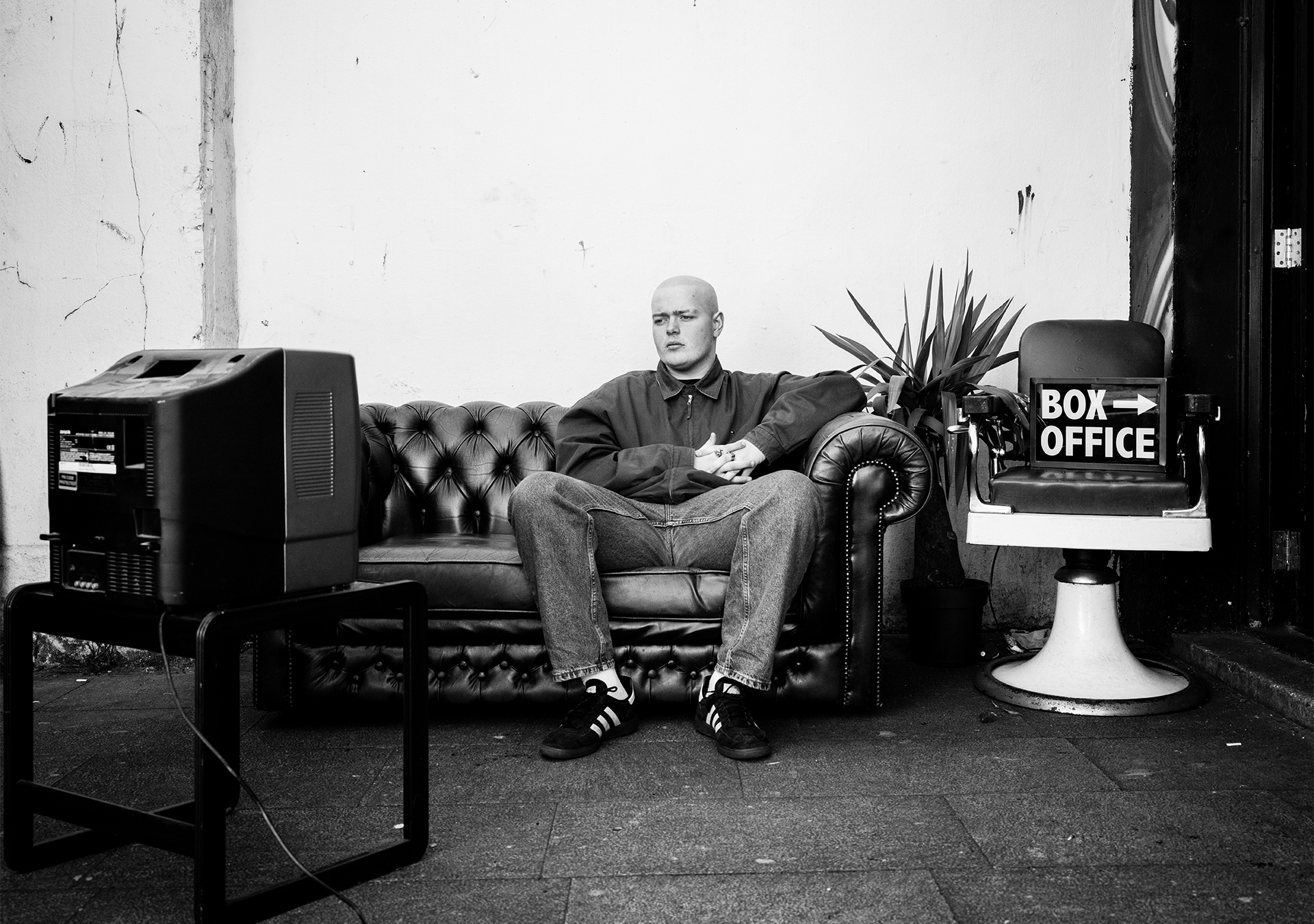
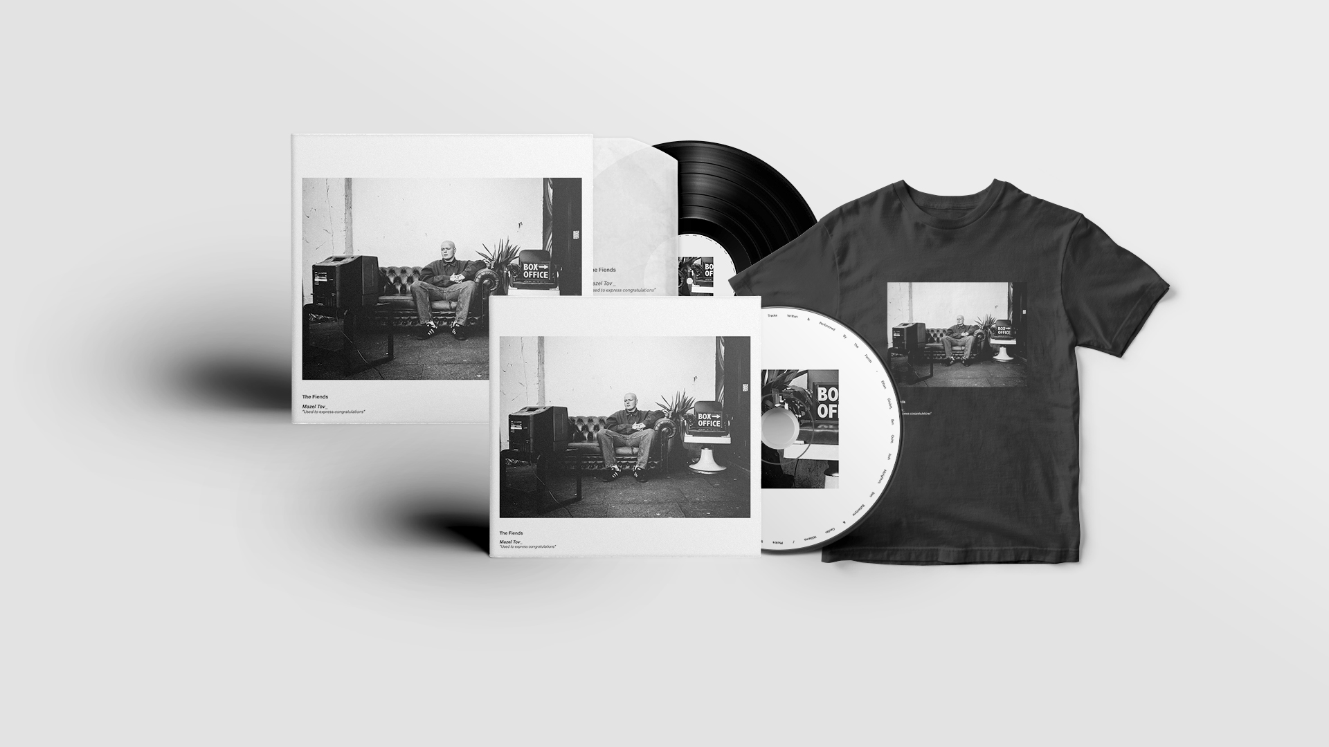
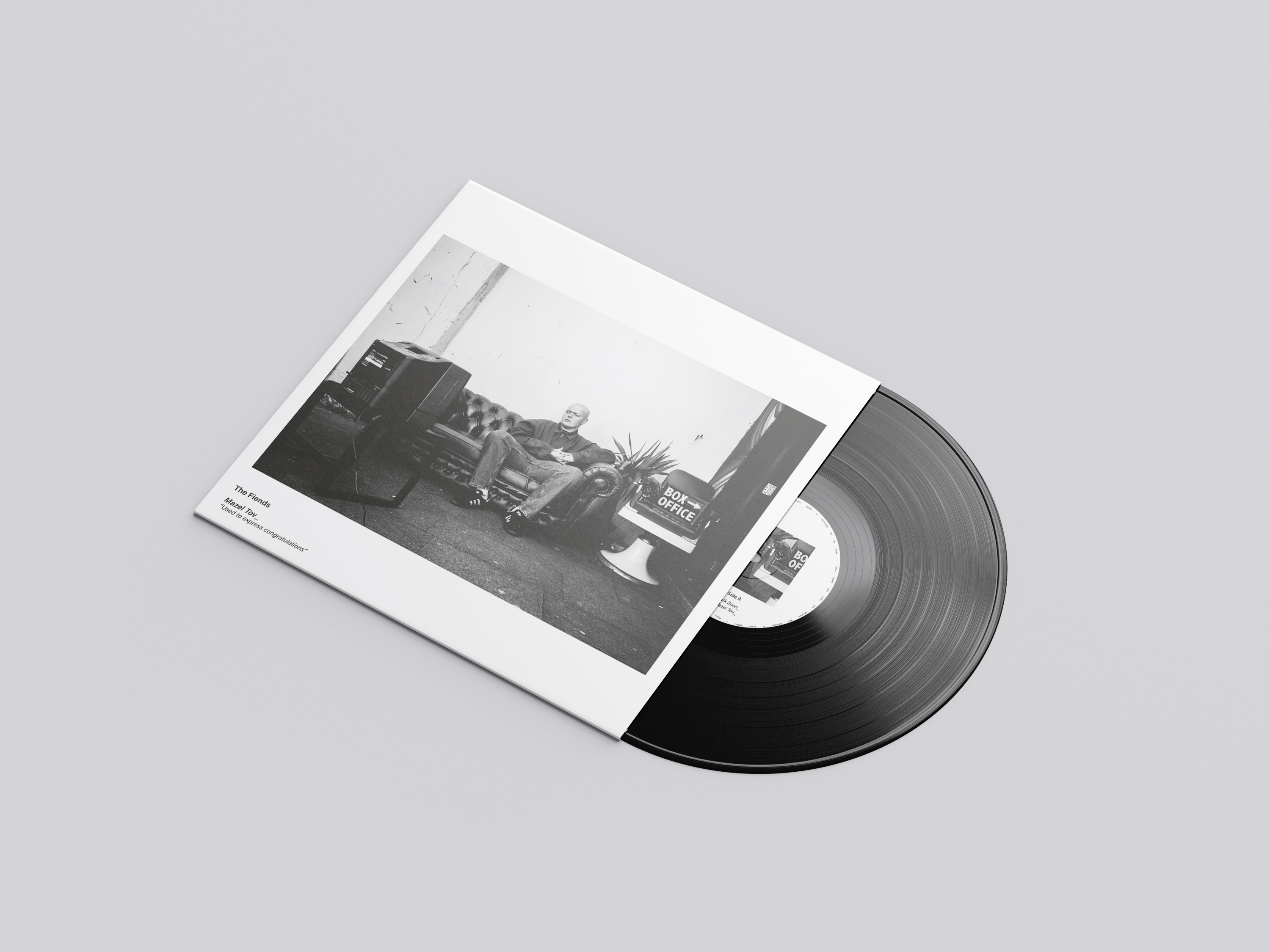
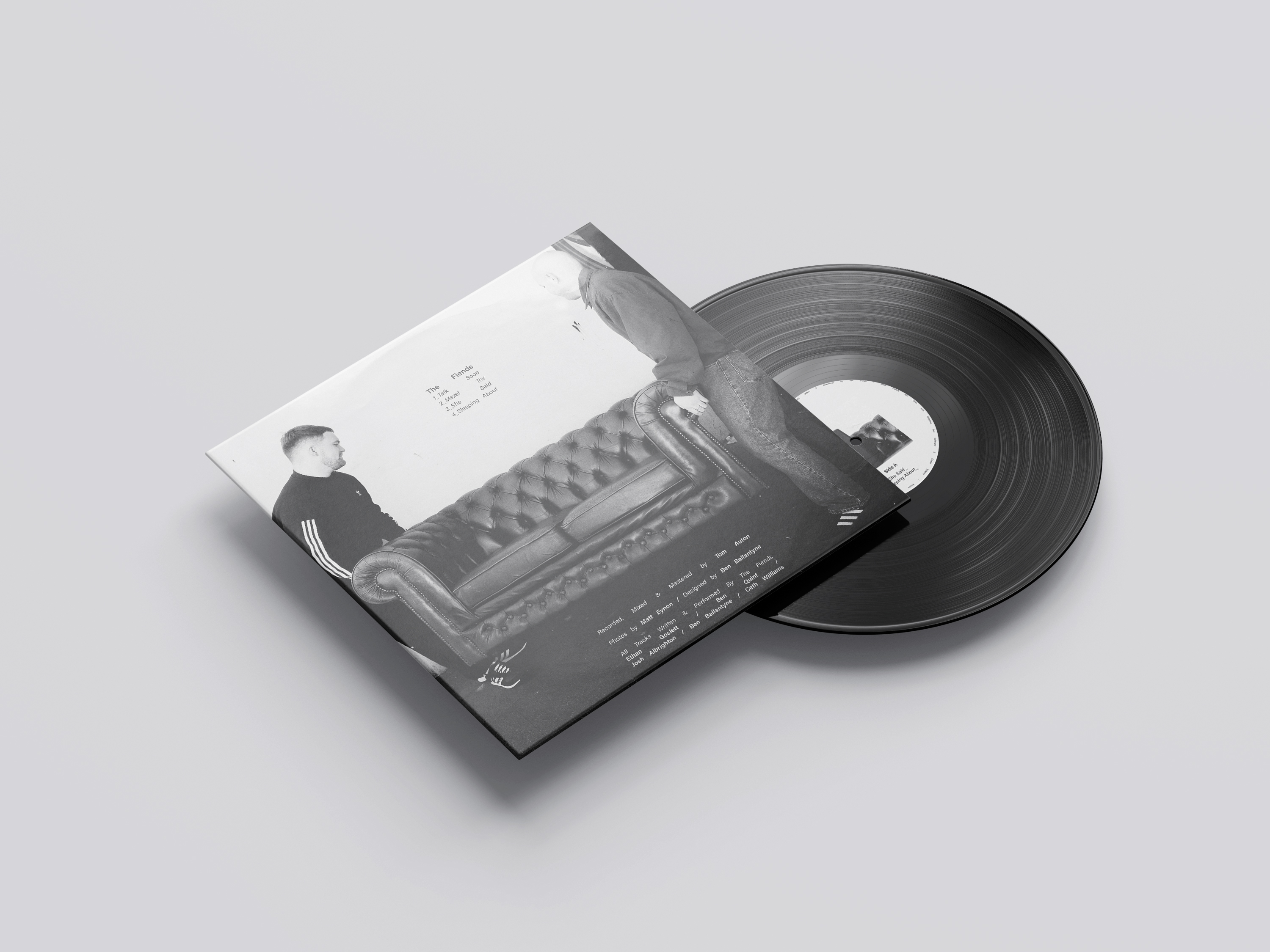
Following Cyanide, the Mazel Tov EP marked a shift towards a darker, more mature tone in both sound and visuals. The indie rock energy evolved into a grungier, more introspective direction, with themes centred on personal struggle and everyday experiences. Visually, this led to a documentary-style approach using raw photography to reflect the narrative depth of the lyrics. This phase pushed the identity further, aligning tone, storytelling, and aesthetic into a more cohesive and elevated body of work.


The documentary has a consistent visual style across all platforms and physical media, including vinyl, lyric books, CDs, merchandise, Spotify canvases, and social media. This look encompassing tone, typography, imagery, and design enhanced the EP identity, making it easily recognizable and resonant with audiences on digital and physical touchpoints.


Since forming in 2020, the lads have gone strength to strength, evolving from a local indie act into a band with growing national and international recognition. Through a consistent visual identity and increasingly refined sound, they have built a strong and engaged fanbase. Their work has led to major milestones including high streaming figures, sold-out releases, festival appearances, and support slots with established artists, reflecting their steady upward trajectory within the music scene.
"Ben played a key role in developing The Fiends' visual identity. He collaborated with the band, implementing ideas and creating designs aligned with our vision. Ben handled multiple design tasks across print, packaging, and digital media, consistently meeting deadlines. His proactive approach and ability to contribute new ideas helped progress the creative process.
The EP received an overwhelmingly positive response, surpassing 100,000 streams on Spotify and selling out all physical copies of Mazel Tov and associated merchandise, marking a significant milestone for a local Swansea band. This level of success reflected both the strength of the release and the growing support for the band.
A distinctive visual campaign that increased social media engagement, strengthened the band’s online presence, and played a key role in their signing with Revolver Records. This heightened visibility also helped secure performance opportunities across the U.S. festival circuit, expanding their reach to a wider international audience.
This newfound visibility contributed to their ability to sell out Sin City (250-capacity venue) and perform on the main stage at Swansea Arena. It also supported international exposure, including a performance at SXSW in the US, alongside a series of notable support slots with acts such as Peter Hook & The Light, The Snuts, and The Lottery Winners.
The shift in art direction proved highly successful, driving a noticeable increase in the band’s social media following and engagement. The more cohesive and mature aesthetic strengthened their identity, making content recognisable and consistent which encouraged greater audience interaction.